

Modern Colour Palettes for Interior Design
Choosing the right colour palette can be transformative, setting the mood and influencing the overall feel of a room from the moment you walk in. With that said, with the abundance of options available and the endless trending design styles for 2024, finding a cohesive and stylish modern colour palette for your interior design project can seem daunting, but we’re here to help. This guide is designed to simplify the process by exploring essential colour theories, the colour wheel in interior design, practical rules, and trending palettes (coastal and minimalist) along with some more classical palette styles (like Georgian and Victorian) to help you create a harmonious and inviting home.
Modern Colour Palettes for Interior Design: Trending Examples
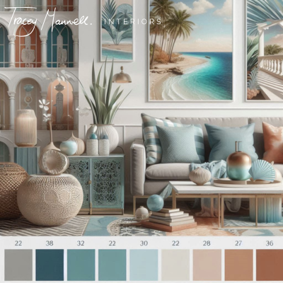
Coastal
Description: Cool, calming hues inspired by the beach. Perfect for creating a relaxed, coastal feel.
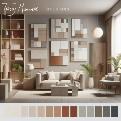
Modern Neutrals
Description: Versatile and sophisticated neutral tones that work well in contemporary settings.
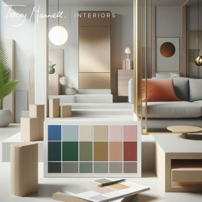
Minimalist
Description: Sleek and simple, featuring various shades of grey for a modern, understated look.
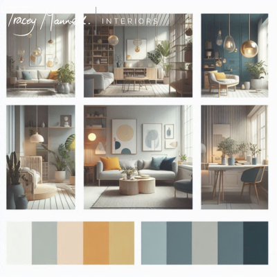
Scandinavian
Description: Fresh and clean, with cool tones inspired by Scandinavian design.
Modern Colour Palettes for Interior Design: Understanding Colour Theory in Interior Design
The Basics of Colour Theory
Colour theory is foundational to effective interior design, providing a framework for creating visually appealing and harmonious spaces. At its core, it starts with the colour wheel, a tool that organises colours into primary, secondary, and tertiary categories:
Primary Colours: These are the fundamental hues—red, blue, and yellow—that cannot be created by mixing other colours. They are the building blocks for all other colours.
Secondary Colours: Formed by mixing two primary colours, secondary colours include green (blue + yellow), orange (red + yellow), and purple (red + blue).
Tertiary Colours: Result from mixing a primary colour with a secondary colour. Examples include blue-green (blue + green) and red-orange (red + orange).
The colour wheel in interior design helps you understand how colours relate and mix, offering insights into creating harmonious colour schemes. Complementary colours, which sit opposite each other on the wheel (like blue and orange), provide striking contrasts and make each colour appear more vibrant. Analogous colours, located next to each other (such as blue, blue-green, and green), offer a more cohesive and soothing effect. Triadic schemes, using three evenly spaced colours (like red, blue, and yellow), balance variety with harmony.
Psychological Impact of Colours
When using the colour wheel to pick out your palette, it’s important to remember that colours influence more than just the look of a space—they shape how we feel in it. Understanding the psychological effects of different colours can guide your design choices and help to achieve the mood you are seeking to achieve:
Blues: Known for their calming effects, blues are perfect for creating a serene environment in bedrooms or any space dedicated to relaxation. They help reduce stress and promote a restful atmosphere, making them ideal for places where you unwind after a long day. However, blues can make a north-facing room feel cold, so make sure to balance them with warmer tones in other furnishings.
Reds: Red is a vibrant and energising colour that can stimulate conversation and activity. It’s well-suited for social spaces like living rooms or dining areas. Use red thoughtfully, as an overuse can become overwhelming. Balance it with neutral tones to maintain comfort.
Greens: Green is associated with nature and balance, offering a refreshing and calming effect. It’s ideal for home offices or bathrooms where a peaceful retreat is needed. Green’s versatility allows it to create a relaxing atmosphere that feels both invigorating and serene.
Personally, I find that aligning a room’s colour with its intended use not only enhances its functionality but also contributes to a more enjoyable living experience. Tailoring colour choices to the specific purpose of each room ensures that your home feels cohesive and comfortable.
The 60-30-10 Rule in Interior Design
The 60-30-10 Rule is a classic guideline to abide by for achieving a balanced and visually appealing colour scheme. This rule involves:
60% Dominant Colour: This is the primary colour used throughout the space, often applied to walls or large furniture pieces. It sets the tone for the room.
30% Secondary Colour: This colour complements the dominant shade and is typically used for smaller elements like upholstery, rugs, or curtains. It adds depth and variety without overpowering the dominant colour.
10% Accent Colour: Reserved for small details and accessories, such as throw pillows, artwork, or decorative items. This colour adds pops of interest and personality to the room.
For example, in a living room, you might choose soft grey walls (60%), a deeper grey sofa (30%), and bright yellow cushions (10%). This combination ensures a well-balanced, visually appealing space that feels harmonious.
Feel free to adapt the rule based on your preferences or specific design needs. The goal is to create a space that feels uniquely yours and reflects your personal style.
Explanation of the 3-Colour Rule
The 3-Colour Rule simplifies colour selection by focusing on three main colours. This approach ensures balance and cohesion while preventing colour overload. For instance, in a bedroom, you might use a combination of soft beige, muted teal, and crisp white to create a serene and inviting atmosphere.
Examples of Colour Palettes
Here are some practical examples of the 3-Colour Rule in action:
Modern Dining Room: A palette of green, grey, and white can establish a calming yet sophisticated environment. The green adds a refreshing touch, while grey and white provide balance and neutrality.
Living Area: Combining navy, grey, and mustard yellow can add a bold and dynamic flair while maintaining harmony. The navy offers depth, grey provides balance, and mustard yellow introduces a vibrant accent.
Choosing colours based on the room’s function and lighting can help create a space that supports its intended use and mood.
Modern Colour Palettes for Interior Design: Trending Colour Palettes for 2024
In 2024, the world of interior design is embracing a range of exciting colour trends. This year’s palettes are diverse, offering something for every taste, whether you’re drawn to serene coastal vibes, minimalist chic, or bold statement hues. In this section, we’ll explore the most current colour combinations that are shaping modern interiors.
Warm Earthy Tones
Warm, earthy hues such as terracotta, rust, and warm beige are currently trending. These colours bring a cosy, grounded feel to interiors, making them ideal for living areas. They create an inviting atmosphere that feels both comfortable and stylish, perfect for spaces where relaxation and comfort are key.
Soft Neutral Shades
Soft neutrals, including whites, greys, and soft browns, offer timeless appeal and versatility. These colours create a clean, uncluttered backdrop that enhances any decor style. They allow for easy updates over time, making them a practical choice for a variety of design schemes.
Bold Jewel Tones
Bold jewel tones like emerald, sapphire, and ruby add a touch of luxury and drama to a room. If you aren’t the type to play it safe, incorporating these vibrant colours through accents or feature walls can inject spaces with a sense of energy. They are perfect for creating focal points and adding personality to your decor.
Calming Blues and Greens
Soft blue and sage green are popular for their ability to create serene, spa-like environments. These colours are ideal for bedrooms and bathrooms, where a soothing atmosphere is desired. They foster relaxation and tranquillity, contributing to a peaceful living space.
Monochromatic Palettes
Monochromatic colour schemes, using varying shades of the same colour, create a sophisticated and cohesive look. This approach can add depth and elegance to a room while maintaining visual harmony. A monochromatic design with cool tones, for example, can enhance a space with subtle variation and refined style.
Modern Colour Palettes for Interior Design: How to Choose the Right Colour Palette for Your Space
Choosing the right colour palette involves a thoughtful consideration of existing elements in your space, such as flooring, furniture, and architectural features. Begin by evaluating these elements to determine which colours will complement or contrast effectively with your current decor.
Something to note for those looking to design rental properties or holiday lets, it’s sometimes wiser to choose more tame colour schemes to appeal to the masses. Check out our full comprehensive guide on interior design for holiday lets to learn about best practice there.
Creating a mood board is a helpful step in visualising different colour combinations and styles. Use tools like Pinterest or physical samples to explore various options and find what resonates with your vision. Always test paint swatches and fabric samples in the actual room to see how they interact with the lighting. This ensures that the colours look as expected and enhance the room’s ambience.
Modern Colour Palettes for Interior Design: Colour Palettes Reflective of Different Design Styles
Different design styles call for specific colour palettes to fully capture their essence. Understanding how colour palettes align with various design aesthetics can help you achieve the look you want. Here’s a look at some popular design styles, both modern and classic, and their corresponding colour schemes:
Coastal Design: Coastal interiors are characterised by light, airy colours inspired by the beach. Think soft blues, sandy beiges, and crisp whites. These hues evoke a sense of tranquillity and openness, reminiscent of a seaside retreat. Incorporating accents like seashells and nautical elements can further enhance this look.
Georgian Design: Georgian interiors reflect the grandeur and elegance of the 18th century. Rich, deep colours such as burgundy, emerald green, and navy blue are commonly used. These hues are complemented by luxurious fabrics and intricate patterns, creating a sophisticated and timeless atmosphere.
Victorian Design: Victorian interiors are known for their opulence and complexity. Deep, saturated colours like maroon, dark green, and gold are often used to create a sense of warmth and richness. Patterns such as damask and floral prints, combined with antique furnishings, help achieve the classic Victorian look.
By starting with a colour palette that aligns with your desired design style, you can more effectively create a cohesive and authentic space. For more detailed information on each style, check out our guides on Coastal Interior Design, Georgian Interior Design, and Victorian Interior Design.
Final Thoughts
Selecting the right colour palette is crucial for crafting beautiful and functional spaces. By understanding colour theory, applying practical rules, and exploring modern palettes, you can design rooms that are both stylish and comfortable. Different colour palettes reflect various design styles, so start by identifying the style that resonates with you. Experiment with colours in your home, and watch how they transform your space into a reflection of your personal style and taste. Embrace the creative process and enjoy the journey of bringing your vision to life.